


- 26th International Biennial of Graphic Design Brno 2014
- Graphic Design, Education & Schools
- 19.6.–26.10.2014
Everybody’s Got to Learn Sometime
Oliver Klimpel
Practicing Artschool
Before we start, allow me a few initial remarks that could help to explain the purpose of this text. Learning and practice are two intertwined modes of the field of design. And as their relationship is so crucial for any progression and dispersion, it is the change of this relationship that is at the heart of understanding the potential of design. On the following pages I will try to describe some key developments in the recent history of this strand of visual culture – and interpret them in regards of education and studio practice. As most of the readers’ perspective will be from a practitioner’s side, me included, I will also refer briefly to some practical responses and projects which I have tested in educational environments, and not shy away from the connected compromised and implicated realities that come with such work.
Young beating hearts
When the progressive forces in art were still called “Avant-Garde”, they frequently defined themselves and their allegiances through the programming of their schools. The Modernist movement showed impressively, from the German Bauhaus, Moscow’s Vhutemas, the Black Mountain College in North-Carolina, or the Ulm School of Design in post-war West-Germany, how important schools could be for the articulation and distribution of an idea. Today, this seems to be the case to a much lesser extent. But in the past few years, there has been a renewed interest in the capacities of art schools as breeding grounds for practices of art and design, and as a stimulus for debates around knowledge production, emancipation and innovation.
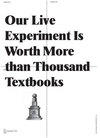
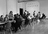
I’ve been living, working and teaching in Britain for most of the past 15 years. The UK is a country whose political expressions differ often dramatically from those of its neighbours. And yet, in 1968, in a time of change, challenge and rigorous debate in France and other parts of Europe, art and design students of the Hornsey College of Art, right in the North of London, had occupied their college in order to force a better arts education. A passionate argument endured about the values of an art school, about its relationships between teachers and students, questions about working individually – and collectively in art, responsibility, programme and self-organisation. This active (and highly constructive) protest had taken on a dramatic and physical form over a period of six weeks – much more than a lamenting student’s essay could ever do. The students’ slogan “Our Life Experiment is Worth More than Thousand Textbooks” is still – to me at least – one of the most beautiful expressions of a practice of teaching that seeks the contact with reality and won’t shy away from the contradictions of the disciplines.The battle for the meaning of education. Still from The Hornsey Film by Patricia Holland, 1970
Poster by Oliver Klimpel for Artschool (UK), 2010
The supplement designed for Bildwelten des Wissens with combined original prints in different techniques, 2011 (Nella Riken, Florian Lamm)
Ways of seeing art schools
If we talk about art and design, what difference does it make if we raise these questions inside a university or college, discuss them in an educational institution? Are schools places of freedom – or, indeed, slavery; environments which foster or hinder thinking about the very art and design that we care for? Is there more sensitivity for the potentials of the disciplines if viewed from within a college context, or observed from the perspective of an “outside” artistic-entrepreneurial practice? Or put differently, which of these two perspectives can really claim to be closer to a sense of practice? Subsequently, one needs to ask which updated idea of practice is the foundation of such a question?
Before the Black Mountain College in North-Carolina were what it now is famous for: one of the most influential post-war Modernist Avant-Garde hubs, with Alan Kaprov, John Cage and Buckminster-Fuller associated with it – Andrew Rice, the subsequent founding director, was looking for support and the funding that would make it happen. Legend has it that, when he was asked if it was to become an art school, he replied: “For god’s sake, no! That’s the last thing I want! Schools are the most awful places on earth!”
The bad news is that we still need art schools – probably more than ever. That is to say, not necessarily you or me. Nor is it, of course, necessary to have graduated from one to be able to produce good art or design. But they can play an important role in a broader sense in the educational landscape of society. The question only is, however: which art schools? To make use of the potential that art schools might still possess, we would have to re-calibrate our understanding of what they are now. And discuss which components or qualities should and could be pivotal in an art school of the future.
Thierry de Duve had summarised some of the various historical models, from the academy to the contemporary art school, and their ideological paradigms in this chronological order, as discussed by Stuart Bailey in his text Towards a Critical Faculty.Academy
talent, technique, imitation
Bauhaus
creativity, medium, invention
“Post-School”
attitude, practice, deconstruction
Current
knowledge, network, speculation
This has proven to be helpful, particularly in order to clarify some shifts that occurred at the end of the post-war Modernist project. In the face of the recent rediscovery of education as an arena of the discipline’s identity, it seems useful to add a representation of today’s situation. I must point out that I’m referring here merely to a Western discourse that is still dominated by players and schools that are still pretty much operating in the tradition of (Post-)Modernism. But it should become clear that, ironically, the progressive attempts of re-defining what art and design practices could mean have already converged with developments in contemporary business.
What previously was described as “current” I have here replaced tentatively by the term “Post-School”, since it particularly seems to encapsulate the post-ideological multiplicity of the 90s and the first decade of the new millennium. To the current of today: We have witnessed, at least ideologically, an increased emphasis on knowledge production, or research activity. It has become the legitimacy of work, a mandate for its presentation or production. Whilst collaboration as a practice is still portrayed as a progressive, non-monolithic, de-centralized and non-corporate model of creation and production, there is hardly a system that epitomizes today’s (late capitalist) entrepreneurial artist or designer better. Constant collaborating is creating new networks of projects, leading to new markets or biennales, revenues and growth, or an accelerated academic presence and profile. Furthermore, the multi-diversified practice is demanding a connection to various platforms that can sustain it economically. Not only concentration on a classic studio practice is sufficient: also external funding structures, residencies, scholarships and similar formats have to be considered and made use of. Although strategic speculation is a vital backbone of strategies in business, too, a strong sense of speculation as a projective principle seems to provide yet the strongest and most interesting and conflicting element for design education. It is a different kind of speculation, however, one that, amongst other aspects, investigates the blurry line between the fictional and factual, and understands design as a narrative trope that can create scenarios. This will only be the case if design can reconnect with some of its inherently Utopian capacities and manages to recognise that the paradox between realisation and non-realisation is futile in a digital world and must be redefined in its entirety.
As the first stage of the project for the Goerlitz Collections, a publication containing the initial research was produced, 2012 (depicted images: Lysanne Bellmare, Anna Gille)
Application of the implemented GÖSAM identity/Goerlitz Collections (student team: Lysanne Bellemare, Constanze Hein, Ann Richter, Marian Arendts, Lea Kontak)
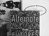
The reader Alternate Futures, a publication about different futures in visual culture and the possibilities to construct new worlds through fiction, 2013
Inside vs. Outside
So if the paradigms of education have changed, and the notions of progressiveness as well, then this has implications on the professional practice, too. What constitutes a progressive practice in art and design today, in studios and ateliers, is not identical to what it meant in, say, the 90s. So let us ask what idea of a progressive practice is developed outside of an educational context?
The discourses of graphic-design have always orbited around certain leitmotifs. When observing the recent decades we can identify some key moments of progression: in the middle of the past century, rationalisation of design decision was a key topic of the graphic Avant-Garde – so we saw the emergence of semiotics in the curriculum, e.g. at the Ulm school. In the 90s formal-aesthetic innovation through digital technology strongly defined a progressive practice, and with its visual merging and layering it connected a discussion about (non)legibility and an “emancipated reader” with the linguistic turn of philosophy some twenty years earlier. Since the late 90s and 2000s, aspects of process and production featured strongly: visual identities displayed a higher degree of flexibility, graphic design referenced regularly its own printing and book-binding methods, taking a leaf out of early minimal art and Structuralist positions. And now graphics is pondering the politics of distribution: questions about publishing and access are high on the agenda. Nevertheless, in terms of an aesthetic development of graphics, there has been a rapture which hasn’t been completely realised yet: since the emergence of internet and the world-wide-web, there is no more underground and sub-culture. Social media have killed the underground. Previously, subculture had infused graphics with new visual styles and languages in the past century. Since the 1950s, when Rock’n’Roll, the first real youth-cultural movement that differed dramatically from adult culture, had produced new expressions in music, fashion and style, various cultural tribes and strands, like Punk, the New Wave or Rave, to name just a few, had brought their original and specific graphic insignia to their specific audiences. After these visual streams of innovation had trickled down into the mainstream and prolonged their new life-span for a little longer, they were usually written off by the graphic elite, as a stylistically toxic wasteland of the recent past.The Neo-Academic Style
From the post-war period until recently, visual subcultures had been instrumental for stylistic innovations in graphic design. Or to put it differently, compared to advertising which had creatively and radically peaked in the 60s and was only dominating through its powerful budgets and ubiquity, graphic inventions had taken place on the fringes of visual culture. Subsequently, the disappearance of graphic subcultures and their diverse and rugged impulses has led to the rise of a neo-academic graphic style in the 2000s, which we could interpret as an academic turn in graphics: sporting the typography of formally-cultured scholarship, of high-brow culture and the aesthetic kicks of (educational) institutions, with the archive and the library as the most prominent pin-up references. For a while now these traditional and hegemonic foundations of the academic world and their occasional deconstructions and critiques have dominated the structural discourse and formal references in independent graphic design production.
A session of “Speed-Teaching” of the System-Design class with first-year students, 2010
In 2013 the System-Design class exhibited work in Solid & Liquid at the Brandenburgischer Kunstverein in Potsdam
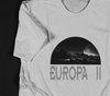
Toxic styles revisited: Edition of T-Shirts by Oliver Klimpel and Aurelia Markwalder, part of the exhibition Scenarios about Europe, Museum of Contemporary Art Leipzig, 2011
Archaeology
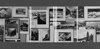
A couple of years ago, I initiated a project called Graphic Archaeologies which looked into pre-digital industrial methods of reproduction and explored disappearing (or disappeared) technologies and their specific graphic qualities. As one of the consequences of the project, we collaborated with the Humboldt University Berlin and the academic journal Bildwelten des Wissens (Pictorial Worlds of Knowledge) and produced a supplement for one issue which assembled printed originals in various techniques, like Xerox, Riso, cyanotype, duotone off-set, Lichtdruck (collotype), and made the results once comparable for the naked eye. Another off-spring of this project was the final project by Florian Lamm, who researched and designed the encyclopaedic book What we can do of more than 300 pages that complied and compared the vast variety of reproduction methods, some of them very exotic, from 1870–1920. It is based on newly gathered and reviewed printers’ samples of the time, showing various screen methods and grainings, and argues for a (historic) correlation between motif and technique. A further extended version of the book will be published at STEIDL this year.
Parallel visual identities
Besides investigations and re-assessments of historical material, today’s challenges of the real complexities and complications of graphic design as a profession are playing a central role in the class: over the period of almost two years, we have realised two identity projects for institutions. However, we didn't develop them one after another, but two student groups worked on them parallel, with a long preceding research phase. So the designs and experiences, concepts and project managements, could infuse and support each other, and aspects would become comparable, in-house, so-to-speak. They also differed in their contexts and fields. Both of them shared a brief for a particular flexibility for the use of languages. For TROPOS, a high-end research facility that measures and interprets clouds and aerosol particles, part of the Leibniz-Group, the identity had to allow for a multi-platform compatibility and multi-lingual applications. In the case of the identity of the Görlitzer Sammlungen (GÖSAM), the municipal art collections and museum of the city of Görlitz on the border between Germany and Poland, a bi- and in some case tri-lingual (German, Polish, English) typographic solution was developed.
The Power of speculation
Alternate Futures was a project of joined contents-production of the class that led to a compilation of various materials, self-generated and edited, in the form of a dense reader. Here we tried to tap into the fictional capacities of art and design to critically engage with visions of our world like Thomas Moore’s Utopian alphabet, design Uchronies (alternative histories) like Michael Moorcock, articulate scenarios, and playfully, or not playfully, anticipate utopian, or dystopian, moments. The premise of this project is that graphics is per se a speculative discipline and must re-connect with its story-telling side, or extend these. For a long time now, the demarcation line between fictional and real graphics has become less clear, a big part of visual discourse happens in blogs, with much material featured being as realistic as the fake placeholder-cover in a publisher’s catalogue. The space between radically alternative imagination and pro-active prognosis – this is an area which graphic design should consider naturally its own.
Speed-Teaching
One example for the design of formats, of the consideration about how ideas meet their audiences, and how the division between the active and passive can, at least for an inspirational moment, be re-defined, is “Speed-Teaching”. The central idea is that learning means also teaching. Like in similar projects of ours, our students become teachers. In this case, following the well-familiar principle of speed-dating, each of the “student-teachers” is facing someone else, i.e. a new student from the 1st year, and presents a useful and suitable topic related to visual practice for 5 minutes. It changes the rules, responsibilities and hierarchies – whilst bringing a very social, direct and entertaining quality to this educational encounter. Speed-Teaching as a project encapsulates the idea of the class that direct interaction and the creation and design of access and communication is part of our understanding of graphics, not only a necessary appendix.
Our Life Experiment
As any other institution too, work at the Leipzig Academy is compromised in many ways; red tape and institutional mechanics, social, financial, political or legal, can often appear as insurmountable obstacles. And yet, much work which I’ve been involved with in this context, was possible because of some Spielraum, as Adolf Loos would have called it, a bit spiel, a few pockets of freedom. Also, one can observe some traces of coherency or identification that hold people in this building loosely, or closely, together. Perhaps profanely a result of the longer time that students and teachers spent in this school together; inevitable because of the longer duration of the courses…
In much of the Western world, there has been a moving apart of art and design students and their institutions. Because of changed financial models of running these schools the relationship between student and teacher has been – in many countries –fundamentally altered. However, it seems important to understand the institutional discourse also as part of one’s (the student’s and teacher’s) learning. Otherwise, there is no mental and physical place for engaging with the school outside the attendance of classes, perhaps even articulating dissent with programmes or politics of education, just as the students of London’s Hornsey Art College and many others have done in the past. It is a life experiment, indeed.
So if inquiry and search for new routes for a practice of learning are central, how can this spirit of a different kind of learning be protected – or reinstalled?Change your heart
Look around you
Change your heart
It will astound youI need your loving
Like the sunshine
And everybody's got to learn sometime,
Everybody's got to learn sometime
[…]Countless covers have appeared over the years of this song. It had first brought The Korgis short and rapid fame in 1980. It was the start of a decade that not only marked a new magnitude and reality of an accelerated capitalism to the Western world but also introduced more and more mercantile elements to art education in the US and the UK. Far away seemed the political Hornsey protest posters with their slogans with nervy and angry lines cut into lino by the students. Much more than merely 12 years seems to stand between these two moments in time. And yet, despite the melancholia that lingers over The Korgis’ song – with the searching cords and synth hooks that seem to look for something but not find – there are still moments of consolation in it.
Yes, one can be fundamentally moved by the drama of a sudden change of perspective. But if “learning” means here not only “understanding” and realising, but “learning” – the sentimental chart-topper seems to make an interesting proposal. The distinction between the adverbs ‘sometimes’ and ‘sometime’ point towards the moment of time when this very understanding happens. So perhaps it is not a matter of choice between ‘sometimes’, as here and there, sporadically, temporarily, and ‘sometime’, at one day, sooner or later.
The tune might just describe a somewhat provocatively optimistic idea of learning, for the arts as much as in life, as something that is deferrable – but ultimately inevitable.
Publications
Biennial News
Summer & Fall issue
Contents
Åbäke
Barbara Steiner
Elisabeth Klement & Pieter Verbeke
Everybody’s Got to Learn Sometime
Fraser Muggeridge
James Langdon
Joris Kritis
Koenraad Dedobbeleer
Kurt Finsten
Linda Dostálková
Mevis & Van Deursen with Moritz Küng
Mikuláš Macháček
Nina Paim
Petr Babák
Radana Lencová
Roosje Klap & Niels Schrader
Rostislav Vaněk
Rudy Guedj
Interview with the Selection Jury
Studio Moniker
Sulki & Min Choi
Tom Vandeputte
Vladimír Kokolia
Summer Issue
Interviews with: Åbäke (GB)The first time Francesco Spampinato heard the word Åbäke dates back to 2002, associated with electronic music label Kitsuné, which is also a quintessential parisienne fashion brand. In fact Kitsuné is just one galaxy – collateral and not even representative – of the Åbäke universe, a London-based design studio behind which lurk Patrick Lacey, Benjamin Reichen, Kajsa Ståhl and Maki Suzuki. Active since 2000, the Royal College of Art alumni count clients like the British Council and the Serpentine Gallery, and collaborations with fashion designers such as Hussein Chalayan and Maison Martin Margiela, artists such as Ryan Gander, Johanna Billing and Martino Gamper, and bands such as Air and Daft Punk.
As the term Åbäke suggests, however, the Swedish word for a large and cumbersome object, Francesco suspects that the group supports the burden of design on commission only to learn rules and conventions that it is happy to deconstruct at other times. Åbäke, indeed, is also responsible for meta-design projects, independent, transdisciplinary, strictly collective and often participatory: the dialogical digital platform for architecture Sexymachinery (2000–2008), the relational culinary events of Trattoria (2003), the publishing project Dent-De-Leone (2009), the propaganda for the imaginary Victoria & Alferd Museum (2010), and the spy agency Åffice Suzuki (2010).
For Åbäke constantly attracts the attention of the art world: most of its projects do not certainly meet criteria of functionality, but raise questions about how design conveys the forms of transmission of culture. Publications, curatorship, talks and workshops, indeed, are integral part of their activities. So when Spampinato invites the group to be part of his book on art collectives, Åbäke agrees to contribute if Francesco writes in exchange this biography, inserting himself, “so it isn't authorless,” in third person, putting thereby in crisis the role of the critic and the conditions under which he normally associates intellectual values to cultural phenomena. , Sulki & Min Choi (KR)Sulki & Min are Seoul-based graphic designers. Sulki Choi studied communication design at Chungang University, Korea, and Min Choi at Seoul National University, Korea. Both earned their MFA degrees in graphic design at Yale University, New Haven, US. They worked as researchers in design at the Jan van Eyck Academie, Maastricht, the Netherlands, from 2003 until 2005. Since they came back to Seoul, Sulki & Min have worked mainly in cultural area, collaborating with institutions and individuals for the design of graphic identities, marketing materials and publications. In 2006, they held their first exclusive exhibition at the Gallery Factory in Seoul, for which they received the Art Award of the Year from the Arts Council Korea. They have participated in many exhibitions at institutions including Frankfurter Kunstverein, Moravian Gallery in Brno, Ningbo Graphic Design Biennale, Anyang Public Art Project, Arko Art Center, Platform Seoul, Gyeonggi Museum of Modern Art, CCA Wattis Institute for Contemporary Arts in San Francisco and Walker Art Center in Minneapolis. They also make and publish books through their own Specter Press, often collaborating with contemporary Korean artists and writers. Sulki & Min worked as graphic designers for the BMW Guggenheim Lab, a collaborative project initiated by the Guggenheim Foundation and BMW, during its three-year operation in New York, Berlin and Mumbai, for which they created an interactive graphic identity system based on on-line participation. In 2013, Min Choi curated Typojanchi, an international biennial of typography in Seoul, as the curatorial director. Both Sulki Choi and Min Choi teach graphic design and typography, at Kaywon School of Art & Design and the University of Seoul, respectively. , Koenraad Dedobbeleer (BE)Koenraad Dedobbeleer is an artist, occasional curator and amateur publisher from Brussels, Belgium. He spends an important amount of his time in the European capital, sharing life with his wife, the no less than brilliant artist, Valérie Mannaerts and their daughter Claude Konrad Mannaerts.
Recent exhibitions include amongst others: Gusiform Gyros at Lisson Gallery, London Weather Permitting 9° Bienal do Mercosul, Porto Alegre Hearsay, Rumours, Bed-sit Dreamers and Art Begins Today at Galerie Micheline Szwajcer The Desperate, Furiously Positive Striving of People Who Refuse to Be Dismissed at Extra City Kunsthal, Antwerp Der Brancusi Effect, Kunsthalle Wien, Vienna
He recently published the book Compensating Transient Pleasurable Excitations with Roma Publications of Amsterdan and together with Kris Kimpe put together a travelling lecture (UP) BAR which originated last March at La Loge, Brussels. , Linda Dostálková (CZ)Established studio The Bestseller Creative Platform (together with her sister Daniela Dostálková, in 2005). She is the head of the graphic design department Text Form Function at the Faculty of Fine Arts in Ostrava. She currently studies at the Werkplaats Typografie in Arnhem. She graduated from scenography at the Janáček Academy of Music and Performing Arts in Brno in 2003, studied new media at the Academy of Fine Arts in Warsaw from 2001 to 2003, and from 2000 to 2001 architecture at the Faculty of Architecture of the Technical University of Liberec. The concepts behind her work are often derived from her studies of performing arts. She is interested in implications of scenography to graphic and exhibition design. , Kurt Finsten (DK)Art historian and architect. Engaged in graphic design, lighting design and painting. Since 1991 director of Krabbesholm Højskole, a Danish art college specialized in art, photography, architecture, design, and graphic design. , Rudy Guedj (FR)Rudy Guedj is a French graphic designer based in Amsterdam. He graduated from the Gerrit Rietveld Academie in 2013. Could it be on autonomous or on commissioned works, his practice often involves the use of drawing. His work generates narratives, typographical or abstracted signs, and explores reading structures and possibilities of the line. , Elisabeth Klement (EE)Elisabeth Klement (1987) is a graphic designer based in Amsterdam. She currently works at the graphic design department of the Rietveld Academie. Together with Laura Pappa she organises the annual Asterisk Summer School in Tallinn. & Pieter Verbeke (BE)Pieter Verbeke (1982) is an arts organiser based in Amsterdam. He is a librarian at the Gerrit Rietveld Academie and has organised exhibitions and projects relating to art collecting and publishing. Since 2011, together they run art book shop and exhibition space San Serriffe in Amsterdam. , Vladimír Kokolia (CZ)Professor Vladimír Kokolia (* 27 November 1956, Brno) is a painter, he lives and works in Veverské Knínice and Prague. He graduated from the AVU academy in 1981. Vladimír Kokolia has had over 90 solo exhibitions and has taken part in 300 groups exhibitions, for example, at the Documenta IX in Kassel. In 1990 he was the first artist to win the Jindřich Chalupecký Prize for artists under thirty-five. Since 1992 he has headed the Graphic Art II department at the Academy of Fine Arts, Prague, and for the last three years has been the vice-chancellor for studies at the academy. Between the mid-1980s and mid-1990s Vladimír Kokolia was the frontman and lyric writer in the E rock trio. He has been practising Chinese tai-chi of the Chen family for over twenty-five years. Kokolia’s outstanding results in composting earned him the Miss Compost of the CR award in 2007. In 2012 he received the Prize from Dalibor Chatrný for the best artist over thirty-five. , Joris Kritis (BE)Joris Kritis (1983) studied graphic design at Sint-Lucas Ghent and was a participant of the Werkplaats Typografie between 2006 & 2008. Since 2009 he is working as an independent graphic designer. From 2009 till 2011 he was designing the arts review Metropolis M in collaboration with Julie Peeters and in 2010 they restyled the graphic identity of the Beursschouwburg in Brussels, which won the public prize in the Cobra Power of Print competition.
Clients include The Royal Museums of Fine Art, Brussels, Contour, Mechelen, the Appel Curatorial Programme, Amsterdam, ROMA Publications, OFFICE Kersten Geers David Van Severen, Canadian Centre for Architecture, Piet Zwart Institute, Architecture Workroom Brussels, BOZAR, Brussels, If I Can’t Dance …, Amsterdam, Elisa Platteau Gallery, EPFL, Lausanne, The Flemish Architecture Institute, etc.
In 2011, his work has been selected for the Brno Biennale and with the book Changing Cultures of Planning, he won the Prix Fernand Baudin, as well as a bronze medal in the Most Beautiful Book of the World-competition in Leipzig. The Flanders Architectural Review 2012 was selected for the Best Designed Books in the Netherlands.
He has been teaching in the Gerrit Rietveld Academie since 2011, and has given workshops in Ghent, Oranjenstadt and Talinn. , James Langdon (GB)James Langdon is an independent designer. He is one of six directors of the artist-run gallery Eastside Projects in Birmingham, UK; and founder of the itinerant School for Design Fiction. In 2012 he received the Inform International Award for Conceptual Design, presented by Galerie für Zeitgenössische Kunst, Leipzig, Germany. He has worked as a designer for numerous artists, and for institutions including Book Works, London; Sternberg Press, Berlin; Contemporary Art Gallery, Vancouver; and OCA, Oslo. Curatorial initiatives include ‘Arefin & Arefin: The Graphic Design of Tony Arefin’, Ikon Gallery, Birmingham, UK (2012); ‘Construction School’, Kunstverein, Amsterdam, Netherlands (2012); Norman Potter’s ‘In:quest of Icarus’, Stedelijk Museum, Amsterdam, Netherlands (2012); and ‘Book Show’, Eastside Projects, Birmingham, UK (2010). He has lectured internationally at institutions including Konstfack, Stockholm, Sweden; Camberwell College of Arts, London, UK; Werkplaats Typografie, Arnhem, Netherlands; HFG Karlsruhe, Karlsruhe, Germany; and Jan van Eyck Academie, Maastricht, Netherlands. , Radana Lencová (CZ)Studied at the VŠUP Prague (1994–2000) and in the school’s doctorate programme (2002–2005). She is a graphic designer specializing in art experiments combining type, light and dance (Metamorphosis of Waste – Transformation of the Soul project). Her current work involves book design and free calligraphy (The Line of Breath project). She has received several awards, for example, the Alfons Mucha Prize; the Brno Biennale Prize (1998); the Most Beautiful Czech Book prize, and others. , Mikuláš Macháček (CZ)Graphic designer, studied at AAAD in Prague and ABK in Maastricht. Following an internship at Studio Dumbar (Den Haag, NL) a member of Studio Najbrt (Prague, CZ) for eight years. In 2011 he establishes studio zetzetzet, together with Sarka Zikova. The studio is focused on graphic, interior and product design. Currently for the third year, Mikulas Machacek is a head of Studio of graphic design 2 at the Faculty of Fine Arts in Brno. , Mevis & Van Deursen (NL)Armand Mevis (1963, Oirsbeek, NL) and Linda Van Deursen (1961, Aardenburg, NL) established their office for graphic design in 1987 in the Dutch Capital after having graduated at the Rietveld Academy Amsterdam. They designed numerous books for artists such as Rineke Dijkstra (NL), Peter Downsbrough (US), Aglaia Konrad (AT), Walter Niedermayr (IT), Gabriel Orozco (MEX), Bas Princen (NL), Cerith Wyn Evans (GB) or architects as Delugan Meissl Associated (AT), Christian Kerez (CH), Office Kersten Geers David van Severen (BE) and SANAA (JP), developed numerous corporate identities as for the Dutch fashion designers Victor & Rolf or the City of Rotterdam, Cultural Capital in 2009, and created templates for Dutch magazines as Metropolis M or De Groene Amsterdammer. Armand Mevis is Head at Werkplaats typography in Arnhem and Linda Van Deursen is Director of the Graphic Design Department at the Gerrit Rietveld Academy; both are teaching at the School of Art, Yale University, New Haven (US). with Moritz Küng (CH)Moritz Küng (1961, Lucerne, CH) is an exhibition curator and book editor working above all at the intersection between art and architecture. He worked together with Mevis & Van Deursen since 1988 on more than thirty occasions, mainly the production of exhibition catalogues and artists’ books. He lives in Barcelona. , Fraser Muggeridge (GB)Fraser Muggeridge is director of Fraser Muggeridge studio, a graphic design company based in London. He also is visiting tutor at the Department of Typography & Graphic Communication, University of Reading, and Camberwell College of Art, London. In 2010 he founded Typography Summer School, a week-long programme of typographic study in London for recent graduates and professionals, now running in London and New York. , Nina Paim (BR)Born in 1986 in Brazil Nina Paim lives and works in Berlin. After a detour into economics and philosophy, Nina studied graphic design at Esdi, Rio de Janeiro and the Gerrit Rietveld Academy, Amsterdam. Her bachelor project was Escola Aberta, a temporary design school in Rio from August 6–11, 2012. Nina's work usually involves many others and revolves around notions of directing and collaborating. Since graduation, she has been working independently as a graphic designer as well as taking forays into the fields of curating, mediating, and teaching. In June 2013 her collaboration with Corinne Gisel was nominated for the Swiss Design Award. , Barbara Steiner (AT)Barbara Steiner is curator, editor and author with an emphasis on politics of representation, institutional critique/criticality, architecture, and display. From 2001 to 2011, Steiner was Director of the Galerie für Zeitgenössische Kunst Leipzig. There, she also initiated the annual art prize INFORM, an accolade presented to graphic designers, who develop a practise within the context of graphic design and art. From May 2012 to May 2013 Steiner headed Europe (to the power of) n, a transnational project, which took place in eleven cities in and outside the European Union. After, she was curator in residence at Castrum Peregrini in Amsterdam. Within the scope of her residency she drew attention to the relation of art and graphic design in particular consideration of their social and economic entanglements. , Tom Vandeputte (NL)Tom Vandeputte is a writer and theorist based in London and Amsterdam. He teaches and convenes a critical theory programme at the Sandberg Institute and is a visiting lecturer at King’s College London. Vandeputte holds an MRes with distinction from the London Consortium and is currently completing a PhD in philosophy at the Centre for Cultural Studies, Goldsmiths College. His writings have been published in various books and journals, including Metropolis M and Log. Together with Tim Ivison, he edited Contestations (Bedford Press, 2013), a book on experimental forms of education and self-organised learning beyond the academy. , Rostislav Vaněk (CZ)Rostislav Vaněk (1945) studied at the Graphic School Prague (1960–1964) and at the Studio of Illustration and Graphics with Prof. Karel Svolinský AAAD in Prague (1964–1970). Between 1971–1976 lecturer in the Studio of Applied Graphics and Poster with Prof. Eugen Weidlich, AAAD in Prague, 1976–1985 head of the art editorial office of Československý spisovatel Publishers in Prague, and since 1985 he has worked as freelance graphic designer in his own studio. In 2001 he has been appointed Professor in the Studio of Graphic Design and Visual Communication, the AAAD in Prague, and has been working there till now. Founding member of Typo& (1974), co-founder and chair of the TypoDesignClub Prague (1995). He designed more than 20 Czechoslovak postage stamps, half of which won an award in the competition for the Most Beautiful Stamp of the Year. Significant realizations: Prague Metro orientation system, visual identity of hotels Forum, Palace, Atrium in Prague, Dvořák Hotel in Karlovy Vary. He designed the logo and manual for the Czech Airlines, including graphic design of all aircrafts and land vehicles (collaboration with R. Leszczynski), visual identity for the Czechoslovak Commercial Bank, the annual meeting of the International Monetary Fund and World Bank Group in Prague 2000, visual style for the International Conference Identity – Integrity, Icograda, Brno Biennial 2002. He created book design for more than 1,000 book titles. His work obtained many awards for graphic design and visual communication, e.g. Special Prize of the Academy of Visual Arts Leipzig IBA Leipzig 1977, Exhibition Graphics Award Praga, The World Stamp Exhibition 1978, Certificate of Honour 10th Brno Biennial 1982, bronze medal Praga, The World Stamp Exhibition 1988, Certificate of Honour IBA Leipzig 1989, Achievement Award Icograda, Identity – Integrity Icograda Conference Brno Biennial 2002, Excellent Design Award, Ministry of Industry and Trade and the Design Centre of the Czech Republic 2003, Organising Committee Award for a contribution to graphic design, Brno Biennial 2010.
Practical Info (Venues, Opening Hours, Admission), Biennial Talks (20.–22.6.2014), OFF Program (Summer term), Brno Biennial Accompanying Events, The Moravian Gallery in Brno (Permanent Exhibitions, Accompanying Programme)Fall Issue
Text: Oliver Klimpel (DE)Oliver Klimpel (narozen v Drážďanech) je grafický designér, který žije v Londýně a vede tam studio Büro International. Podílí se na mnoha designových projektech pro kulturní i komerční sektor, jako například Tate Modern v Londýně, Museum Folkwang v Essenu, Goethe-Institut v Londýně či Taipei Contemporary Art Center. Po letech vyučování na Central Saint Martins College of Art & Design a London College of Communication byl v roce 2008 jmenován profesorem na Akademii výtvarných umění v Lipsku, kde vede třídu systémového designu. – Everybody's Got to Learn Sometime
Interviews with: the Selection Jury, Petr BabákPetr Babák (Graphic Studio Laboratoř) “He handed in two graphic designs into the tender for the New Logo and City Visual Indentity of Brno. One contained slogan ‘Brno is the golden Ship’ and the second one was crossed out Hradčany. At the Academy of Arts, Architecture & Design in Prague in the Atelier of Graphic Design and New Media, as well as in the Graphic Studio Laboratoř, he rules with infantile sophistication…” (Michal Nanoru, Živel) , Luna Maurer (NL) & Roel Wouters (NL), Roosje KlapRoosje Klap (1973) has set up studio for visual communication after her Graphic Design studies at the Gerrit Rietveld Academy in Amsterdam. Roosje Klap mainly works for a clientèle in the cultural field. & Niels Schrader (NL)Niels Schrader (1977) studied Communication Design at the University of Applied Sciences in Düsseldorf and at the Sandberg Institute in Amsterdam. He worked as a freelance designer for Uwe Loesch and Irma Boom and set up his own studio in Amsterdam.
Practical Info (Venues, Opening Hours, Admission), Back to School! (19.–21.9.), OFF Program (Fall term), Brno Biennial Accompanying Events, The Moravian Gallery in Brno (Permanent Exhibitions, Accompanying Programme)Colophon
Interviews: Tomáš Celizna (CZ)Tomáš Celizna (1977) is interested in graphic design in connection with new technologies. He is a founding partner of design studio dgú in Prague (2001–2005), recipient of J. W. Fulbright Scholarship (2006), and holds M.F.A. in graphic design from Yale University School of Art (2008). He currently lives and works independently in Amsterdam. Collaborations include, among others, BAK, basis voor actuele kunst, Utrecht; Graduate School of Design Harvard University, Cambridge; Faculty of Architecture CTU, Prague; OASE Journal for Architecture, Rotterdam; Royal Academy of Art, The Hague; Sandberg Instituut, Amsterdam; Stedelijk Museum, Amsterdam and The New Institute, Rotterdam. Since 2011 he is a lecturer in graphic design at the Gerrit Rietveld Academie in Amsterdam, and a member of the curatorial team of the International Biennial of Graphic Design Brno. , Adam Macháček (CZ)Adam Macháček (1980) is a graphic designer. Following studies at the AAAD in Prague, Gerrit Rietveled Academie in Amsterdam and Ecal in Lausanne, he co-founded in 2004 studio Welcometo.as in Lausanne and is a member of 2014 Designers collective. His work includes publications, exhibition catalogues, illustrations and identities. Collaborations include, among others, The Moravian Gallery in Brno, Théâtre de Vevey (2003–2012 seasons), Galerie Rudolfinum, SFMOMA, Chronicle Books, Museum of Czech Literature, Brno House of Arts. For Brno Biennial he initiated and organized exhibitions Work from Switzerland (2004) and Work from Mars (2006, together with Radim Peško). Since 2011 he is a member of the curatorial team of the International Biennial of Graphic Design in Brno. He lives and works in Berkeley. & Radim Peško (CZ)Radim Peško is a graphic designer based in London. He works in the field of type design, editorial and exhibition projects. Work includes identity for Secession Vienna (AT), Berlin Biennale 8 (DE) in collaboration with Zak Group, various work for Moravian Gallery, Brno (CZ), Eastside Projects, Birmingham (UK) or a long-term collaboration with artist Kateřina Šedá among others. In 2010 he has established his RP Digital Type Foundry that specializes on typefaces that are both formally and conceptually distinctive. He teaches at Rietveld Academie in Amsterdam (NL) and École nationale supérieure des beaux-arts de Lyon (F). Since 2011 he is part of curatorial board of International Biennial of Graphic Design in Brno (CZ). , Kateřina Přidalová (CZ)Kateřina Přidalová (1978) studied history of art at Masaryk University in Brno. She is a publicist, critic of design and editor of design and visual culture website Designreader.org. She founded blog VizualniKultura.cz and writes for cultural magazine A2 and Biennial News. As a lecturer of workshop Graphic design is (not) ageing (2013) collaborated with NGO Czechdesign.
Edited by: Martina Tlachová, TC&AM&RP, Miroslava Pluháčková
Graphic design: TC&AM&RP
Printed by: Tiskárna Didot s. r. o.Czech/English, 180 × 350 mm, 48 & 32 pages, self-cover, staple-bound
The Moravian Gallery in Brno, 2014Availability
Both issues of the Biennial News are available for free to the visitors of the 26th Brno Biennial 2014, and in selected cafés across the city of Brno.
/1